

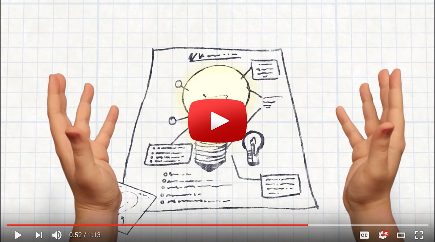
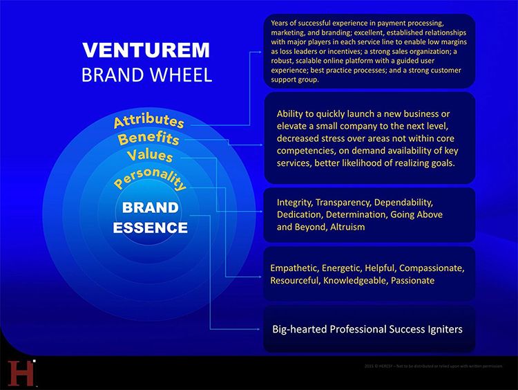
WPP’s Digital Acceleration Training (DAT)
WPP needed a way to extend its live Digital Acceleration Training program by VML to the Internet to allow its ~200,000 employees — especially executives — the opportunity to learn about the ever increasingly important universe of digital and emerging media trends.
Ultimately, the task centered on designing an eLearning platform and creating the curricula, lessons, and testing methods. Flash was chosen as the environment because of how it handled interactive animation and video at the time. A modular system was created that could flow together or be taken on one at a time — modules covered topics such as SEO, SEM, mobile, gaming, digital strategy, and so on. Test takers could pause the lesson whenever they wanted and come back where they left off, but once they took the tests that would appear after each part of the lesson, they could not retake them.
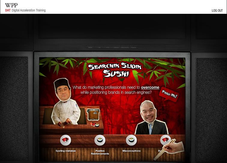
The lessons were presented via on‐screen animation that accompanied a voiceover, which served as the old world educator giving long‐winded and fairly boring accounts of what everything means. The voiceover would be repeatedly interrupted by an animated foil in the form of the twenty‐something millennial target audience, most desired by marketers.
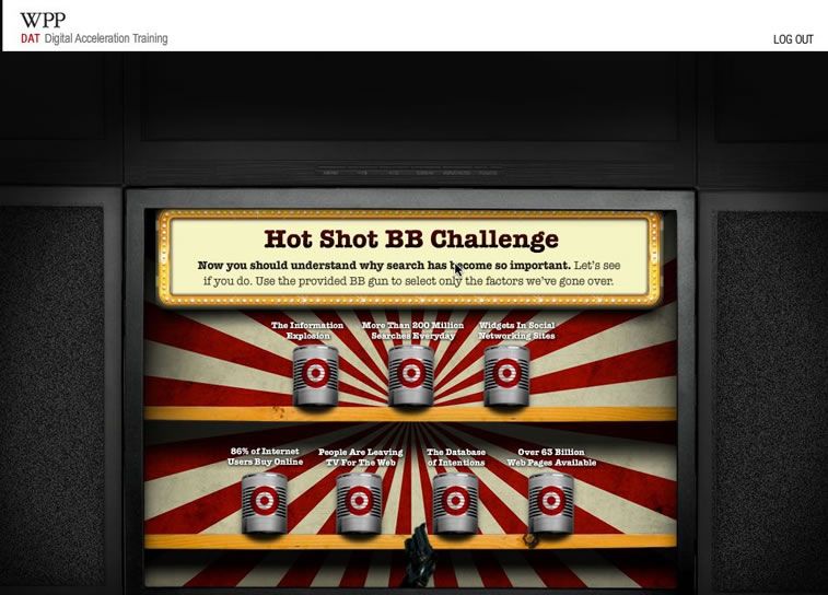
The foil would pull out a mobile device, laptop, tablet, MP3 player and so on to visually demonstrate what the concept meant using a metaphor presented through new media technology. The tests were all game oriented and entertaining to ensure the participants would be engaged and understand the material they just were taught.
Digital Doesn’t Matter
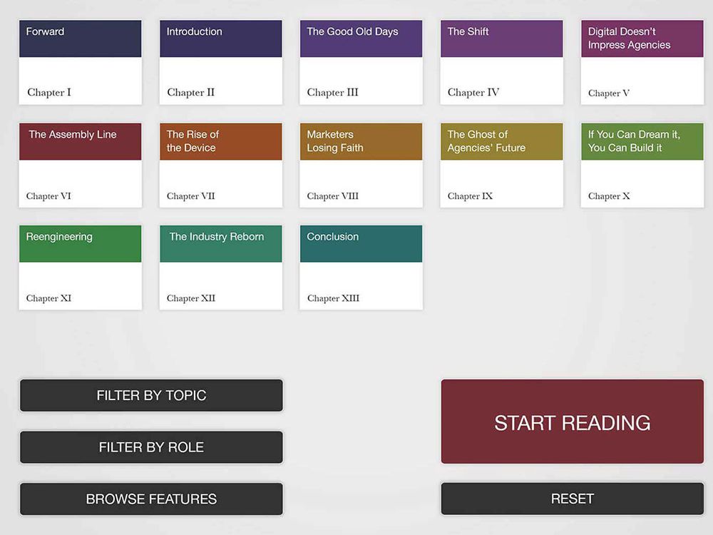
Sadly, more and more people seem to be eschewing reading anything that’s not posted on a social media platform — and we don’t just mean the current US President. So we thought it was time to reinvent “the book.” It is the 21st century, after all, and although we do love curling up with a physical tome, we recognized the limitations of the printed page and thought a tablet app might do wonders for the experience. Although we came across some beautiful app interpretations of magazines, everything related to books were nothing more than glorified PDF readers or, at best, Kindle knockoffs.
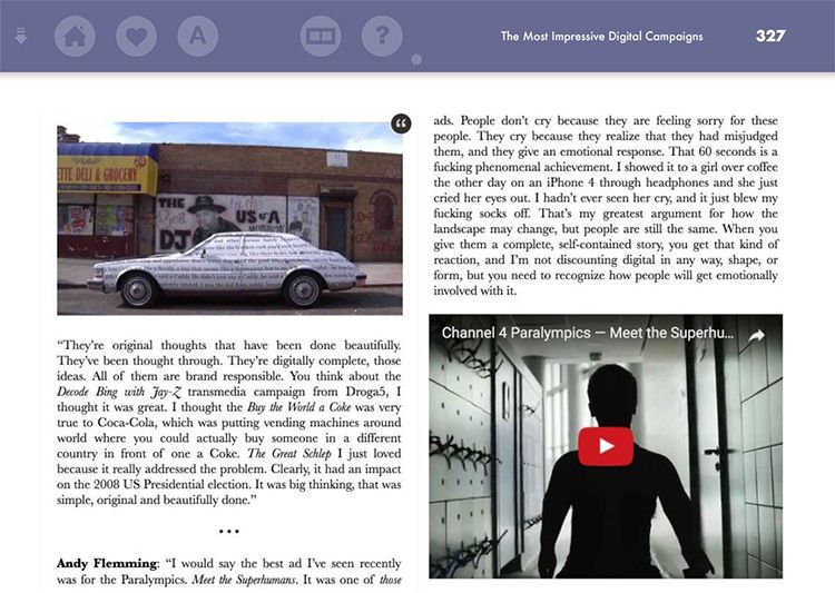
We wanted to make reading as pleasurable, flexible, customizable, interactive, and generally useful as possible and we decided to start with our own book,“Digital Doesn’t Matter (and other advertising heresies).”In it, we interviewed over 130 advertising experts from around the world based on their particular respective disciplines, which allows readers to filter out the roles they’ not particularly interested in and only see what is relevant to them. They can also rearrange the chapters in any order that suits, go to an area that has the most interesting quotes from the interviews and another that has detailed profiles and contact info for everyone we spoke to (along with their interview quotes), which is also accessible by touching their names throughout the book.
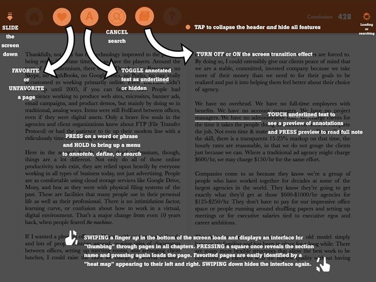
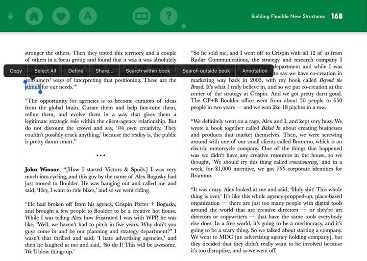
Within the chapters, we have numerous options: embedded photos that spin around and deliver detailed information when touched, sidebar info related to sections sliding out to receive comments, interactive footnotes, and playable / expandable videos, all to supplement the main content. Readers can even annotate any bit of the text for themselves and anyone else reading the book on their own iPads while having threaded comment discussions at the end of each chapter. Pressing and holding on a word brings up a definition or allows a reader to see all references in the book to that word or name and quickly jump to it. One can “favorite” pages and use these bookmarks to access them later at a touch and even “thumb” through the entirety of the book, seeing the chapter and section titles as they do along with a heat map that appears as they close in on a page they have favorited. If they just want a pure reading experience, all of the visible features can be toggled off and disappear with a simple touch of the header.
If someone is interested in reading a full interview because they like a passage or would like to see the full source material, they can “dive” down under the book and open it up, then come back to where they left off. Best of all, we are able to update the content and push it out to anyone that has already installed the app so it will never be out of date. All of this and more packaged up in a friendly, beautiful, and intuitive user experience that should make sitting in front of a fire with an iPad even more satisfying than the books of yore.
The Research Exchange (REX)
Investors in startups have a couple of problems: 1) They have no idea if some other group is already working to solve the same problem (and maybe doing it better) and 2) they don’t usually have much insight into the personalities of the team in which they are putting their money. The Research Exchange (aka REX) solves those key problems by bringing together all of the disparate data from R&D groups at universities and major corporations into a standardized format and providing a social network environment where the potential investors can observe the individual members of the teams and how they get along.
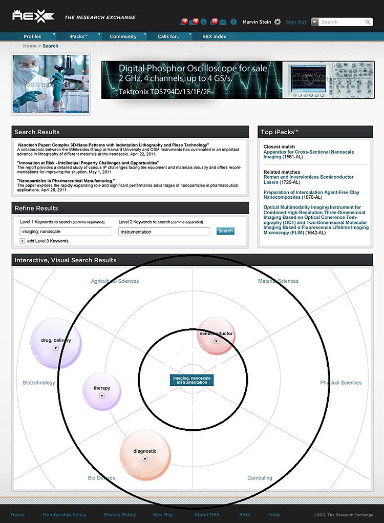
Heresy was involved with REX from the time this idea was merely sketched out into some diagrams. We designed the look and feel, streamlined the logo, envisioned the platform, the user experience, and built it out into a scalable system, bringing to life the visual search that allow investors to use a number of tools to find intriguing technologies that they may wish to help bring to life with funding. The search not only shows them how many active projects are underway, but uses color coded bubbles to alert them to related areas that they may not have even knew existed.
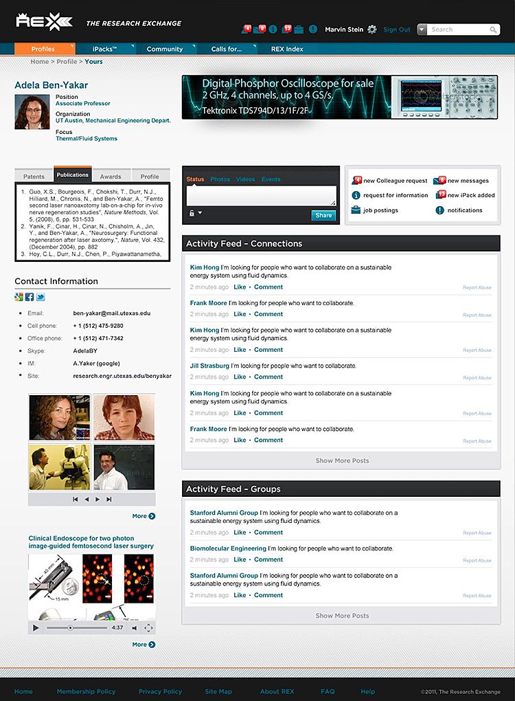
In addition to the sophisticated search mechanism, the unified format for all of the researcher data that for the first time makes it simple for investors to compare projects, and the robust social network environment similar to a system like Facebook that we built from scratch, Heresy created illustrations and crafted a video commercial using rotoscope to convey the company’s brand personality and benefits to potential users of the system.
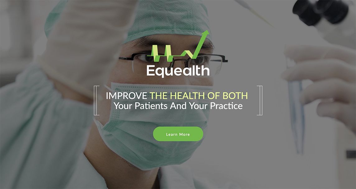
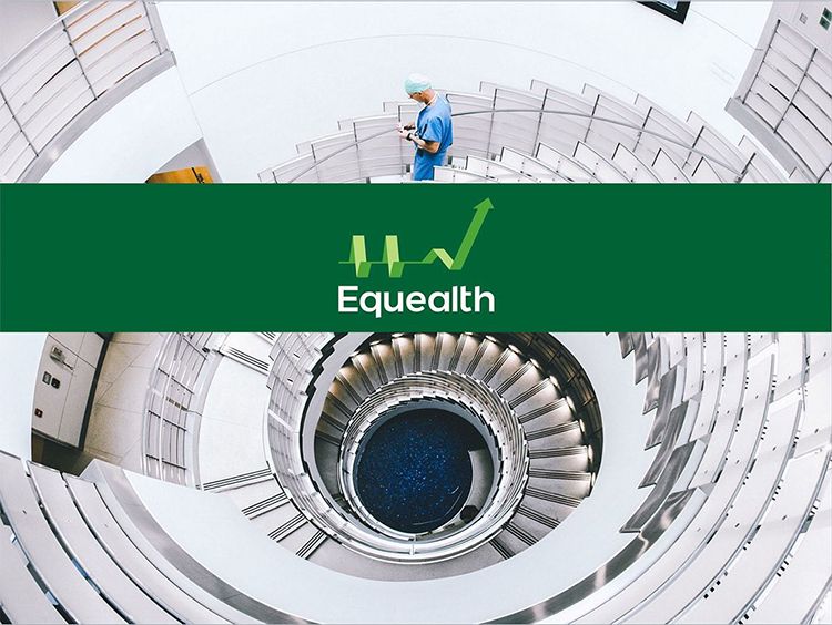
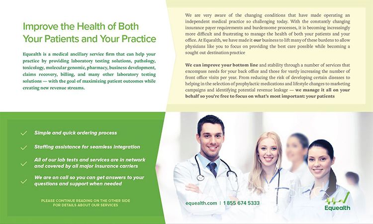
Equealth
As most of us are well aware, doctors get into the business of medicine to help people (and so their mothers can boast to their friends), which is fortunate since most with private practices are barely able to break even and with many operating in the red, so to speak. This is largely due to the way insurance companies now pay out claims, the overwhelming overhead that is required along with the skyrocketing cost of getting a medical degree and continuing education requirements. Equealth’s mission is to help medical practices become more profitable while best serving what is most important to physicians: their patients. In fact, we came up with the name and corporate identity to communicate that Equealth equips patients with better health and doctors with more wealth.
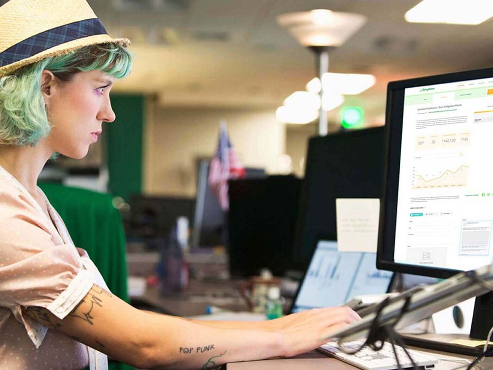
EasyRaise
There are a lot of crowdfunding sites out there and most of them are fairly similar in their offerings. EasyRaise, however, was created to fill a void for nonprofits that found the options difficult for their generally small, non-technical staffs to manage; do not provide reporting that is useful for their management and supporters; and rely upon hitting up their own social networks over and over in order to gain any traction toward their goals.
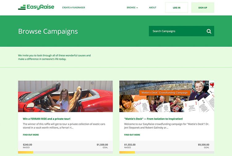
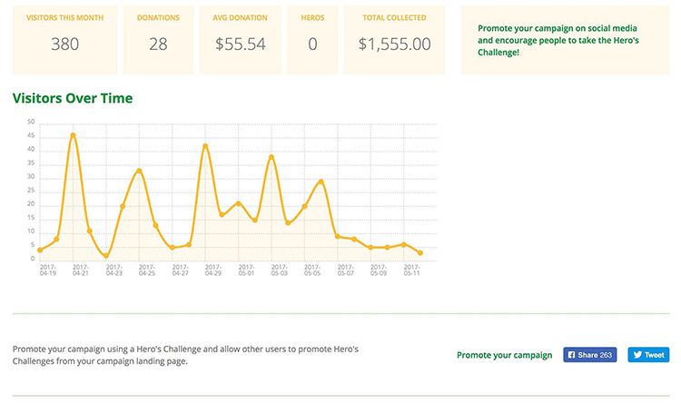
EasyRaise helps the charities with all of that by living up to the name Heresy gave it by being exceptionally simple to set up, providing hand holding support for those that don’t have the inclination to give it a shot on their own, providing detailed reporting on every facet of the people donating and what has enticed them to support the cause, giving 100% of the funds to the charity (if someone gives $50, the campaign receives $50), and providing a feature called “The Hero’s Challenge” that activates a participant’s own social network to amplify the call to arms. The reporting system logs the people who have taken it and how much they have raised so the administrator can reach out to them for help with future campaigns.
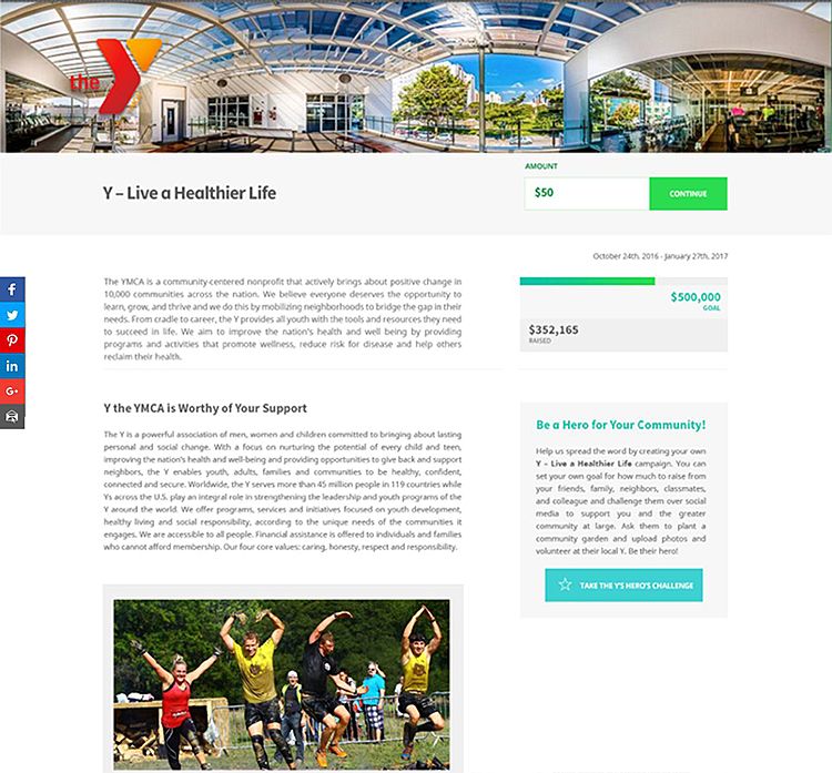
A charity that is too small to afford or maintain their own web site can even create an EasyRaise landing page with their own branding that allows them to state their mission and collect funds perennially without a timeframe or goal amount (and has The Hero’s Challenge available, too), and to create as many campaigns as they wish, with those that have expired archived for historical reference. Heresy created the brand platform, the name, the strategy, the design, the site, the marketing material, the pitch decks for each charity, and supported the launch events and PR activities that resulted in hundreds of TV and print news outlets picking up the story.
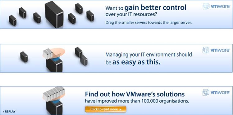
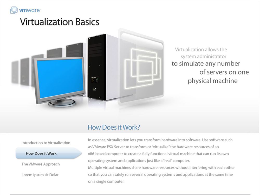
VMware
VMware was looking for a simple solution to a complex problem from us in our then agency, WPP’s BLUE. It was introducing its brand to the multi‐cultural Asia Pacific market and needed to somehow explain the complex subject of virtualization, its primary offering, to IT managers and business decision makers. Those audiences knew very little about the technology, let alone the tremendous competitive advantages VMware has over its competitors. Oh yeah, and it all had to make sense in multiple languages.
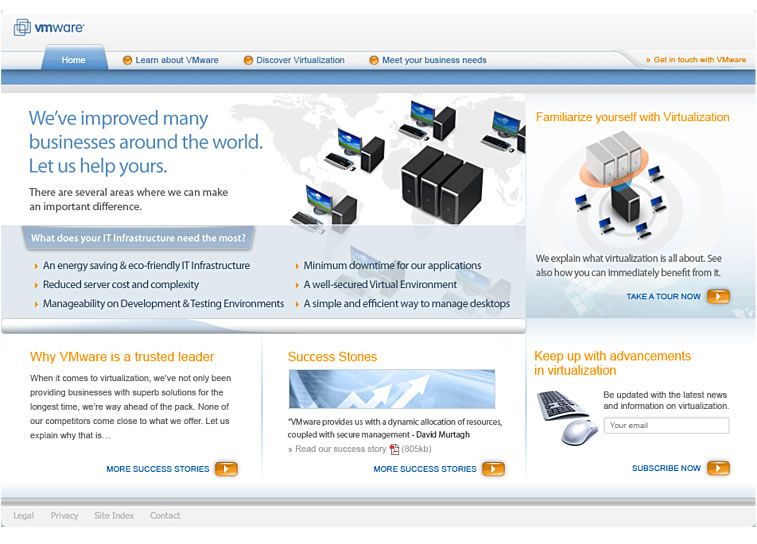
Sleeves were rolled up and a series of animations were written that educated the audiences in an illustrative manner as to exactly what virtualization is and what it enables in terms of bottom line business needs. They were then translated into local languages (e.g., Japanese, Korean, Chinese, English) and concepts. And finally, supported with interactive banner advertising that would lead prospects to a microsite where they may view the lessons to understand the benefits of virtualization, learn about the company and its capabilities, and find out more about custom solutions.
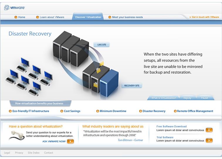
Through help from the site, business and IT professionals who once only had a vague awareness of the benefits of virtualization, became educated to how virtualization could help with many of their critical areas and how specifically VMware solutions could help their business.